
CASE STUDY
Planting the Seed for a Brand That Lasts
CLIENT
A boutique property management company serving commercial and residential owners across Midcoast Maine, with the personal attention bigger firms can’t match.
Acorn Properties
CHALLENGE
How do you look artisanal, approachable, and fully professional, all at once?
Acorn's founder knew exactly what her business was: professional property management with a calm, personal touch. Decidedly not a big, faceless firm, nor an informal mom-and-pop operator. DIY templates never captured it. She wanted an artisanal, low-key look that captured both sides of her: warm and personal, but thoroughly capable, reliable, and polished.
WANT MORE?
See the complete case study
Enter your email and we’ll send the extended case study!
SOLUTION
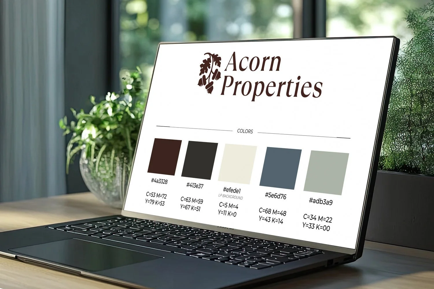
A brand built with a careful balance of warmth, simplicity, and polish.
We first took the time to understand each event's own identity, as well as the community’s spirit. We then designed materials to reflect the event, the season, and the town’s goals. We quickly became the Town of Bowdoinham's trusted creative partner across all three annual flagship events, year after year. Our scopes and contracts were straightforward and itemized - so the town always knew what to expect.
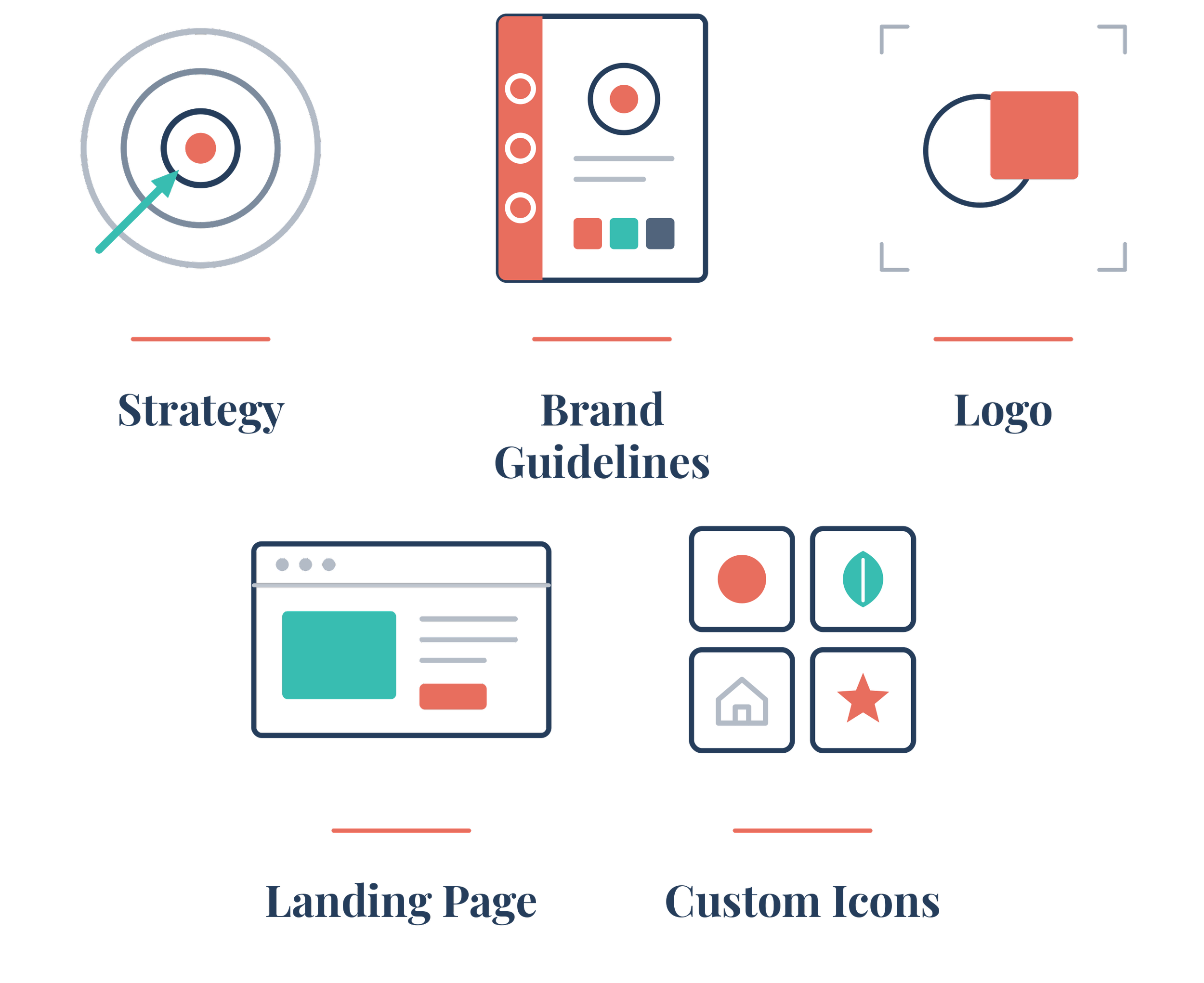
What we built
Brand strategy
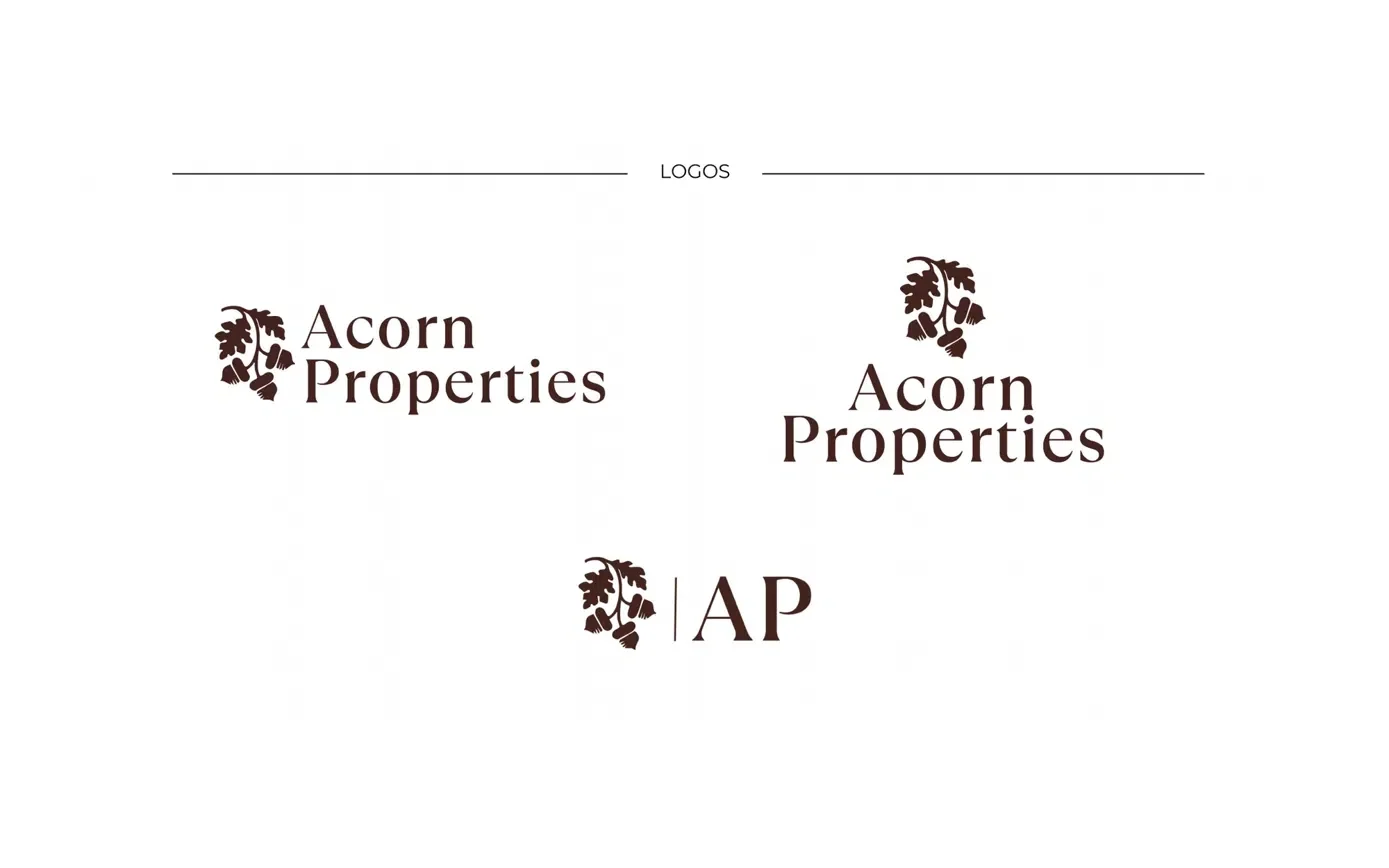
Logo and lockups
Brand standards guide
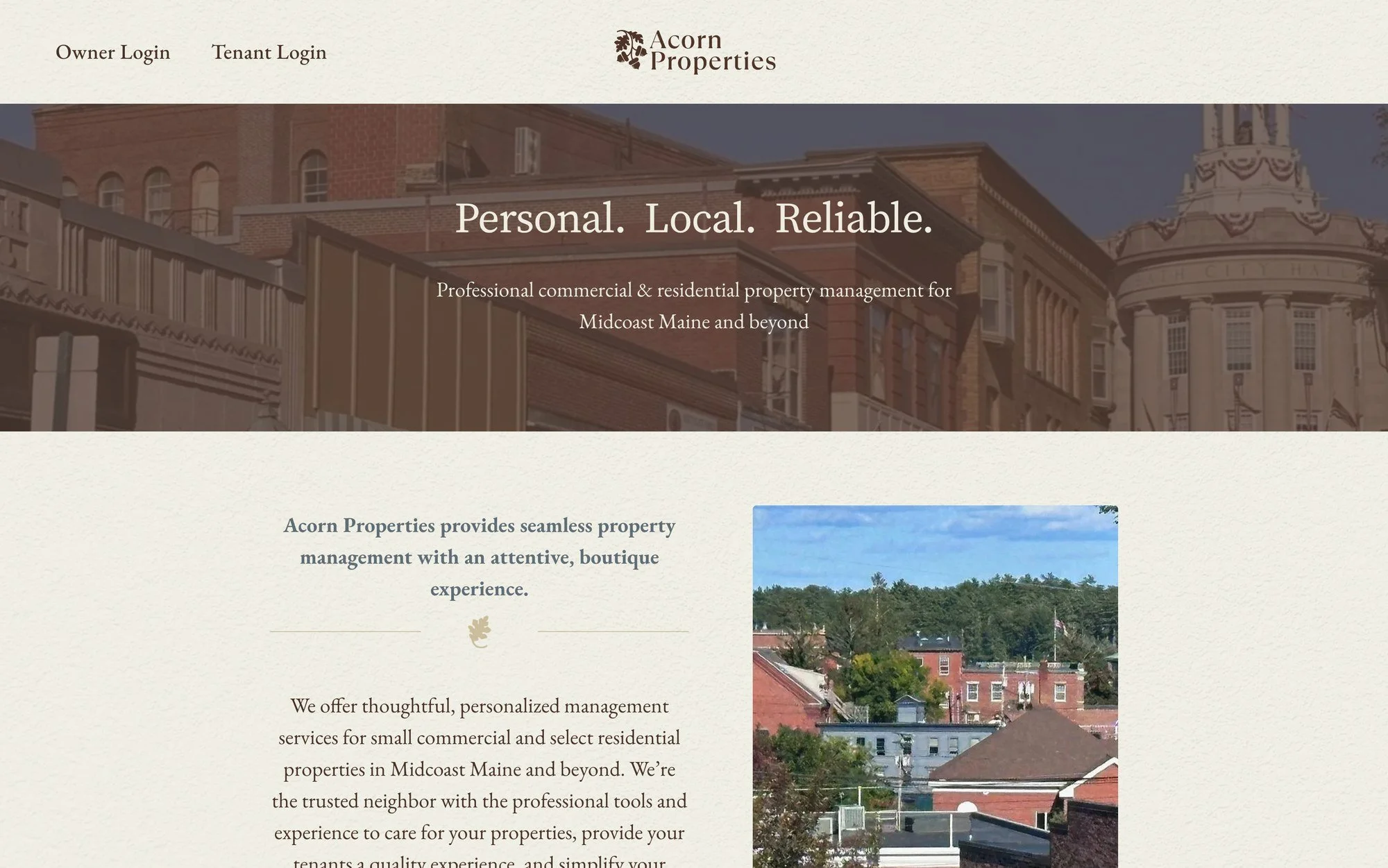
Custom landing page
Owner & tenant portal buttons
Available listings section
Favicon and custom icons
RESULTS
From a name to the brand the founder pictured, ready to grow.
Consistent, recognizable identity across the logo and landing page.
Owner and tenant portals integrated for seamless access.
Available listings section ready to feature properties as the business expands.
"Purpose & Proof's professionalism and expertise made designing a brand and setting up a website for my new company seamless. They worked with my timeline and built my ideas into something better, creating everything I needed to establish an online presence that communicates the values of my business."
“…Designing a brand and setting up a website for my new company was seamless.
Founder
Acorn Properties
Let’s Talk
From crafting unique brand identities to designing intuitive websites and highly functional sales collateral, we're here to execute your ideas.